Although the changes are still in development, we have been releasing bits and pieces of Home Feed changes and doing A/B testing on them, and we have got positive response from users.
Also, we ended up creating a whole design system for our mobile application and desktop designs on Figma, which was not only a huge learning for all, but also made our design processes faster.
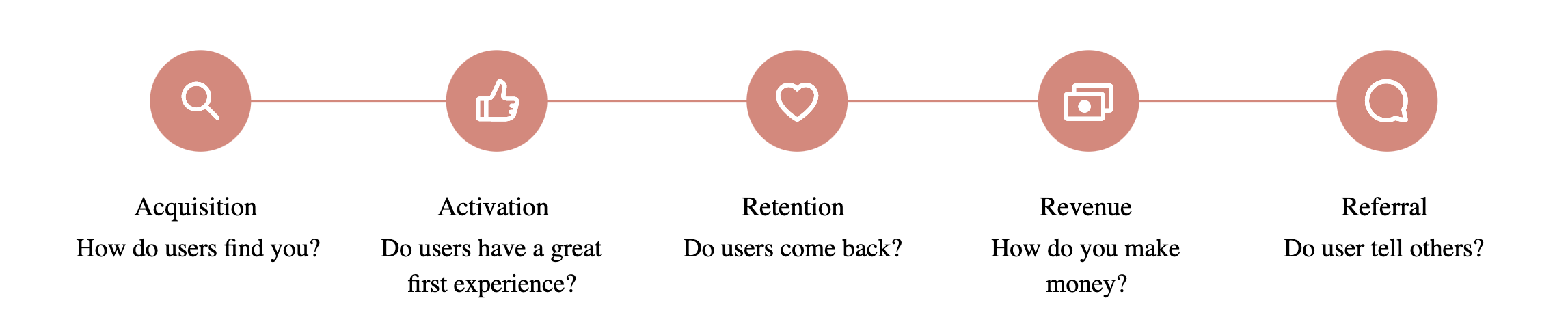
To measure success of A/B testing we decided on using below metrics
Business Metrics
- Number of L2 bought (add to cart) / app launch (non search)
- Average Order Value
- New Users - Number of First time shoppers
- New subscriber of Smart Bachchat Club membership
- Wallet Share
- New Referrals
Engagement Metrics
- Time on app - Total visit duration
- Page Visit - Number of pages visited per user
- Fold Visit - Number of folds visited per user
- Bounce Rate
- Click through rate on Product Listing Page, Collection Widgets
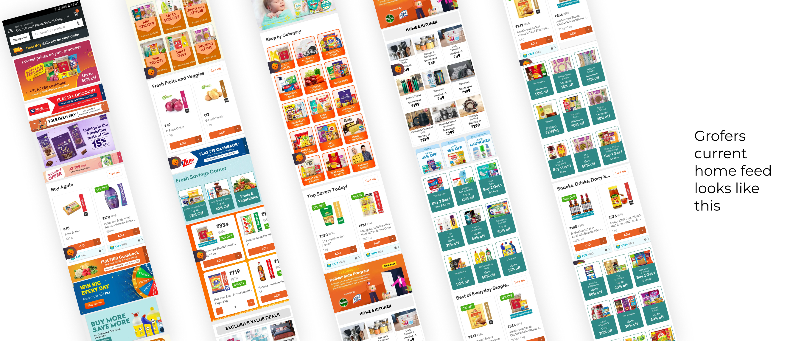
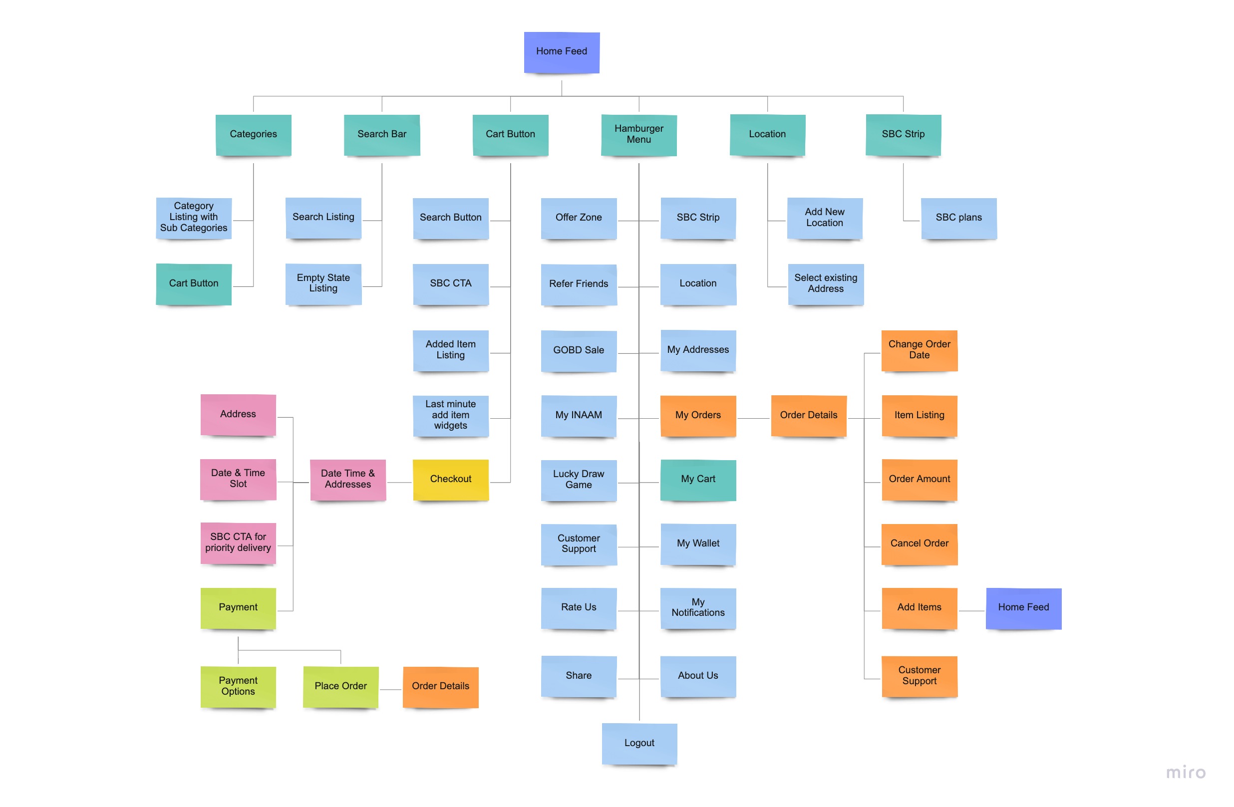
Home Feed
We introducing bottom navigation bar on home feed for easy & fast browsing. The home feed now has focus on shopping experience and not on offers and sales. The sales and offers part has been moved onto another section. Home feed now offers better exploration through membership.
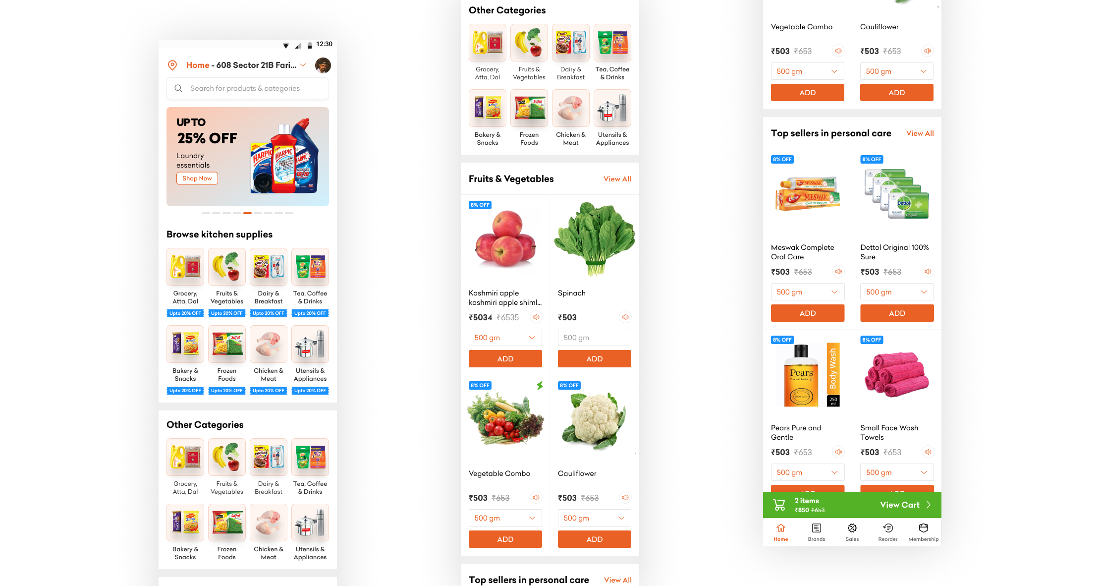
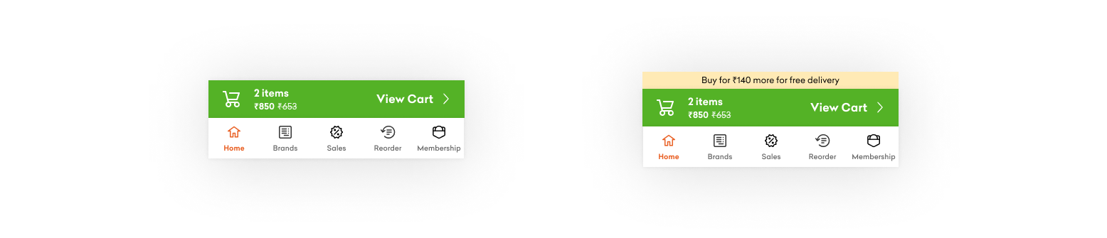
Checkout button
We have added persistent checkout button at the bottom now, it gives easy access to total amount, number of items and any MOV related information/ offers. Earlier users had to go back and forth from cart to shopping pages to check total amount of order.
Navigation Bar
We had done few experiments earlier around navigation bar and got positive response back then, so we incorporated this with our app revamp as well. We have placed the most important features in navigation bar (important in terms of user as well as business) - Home/Categories, Brand, Reorder, Sale/Offers, Membership.
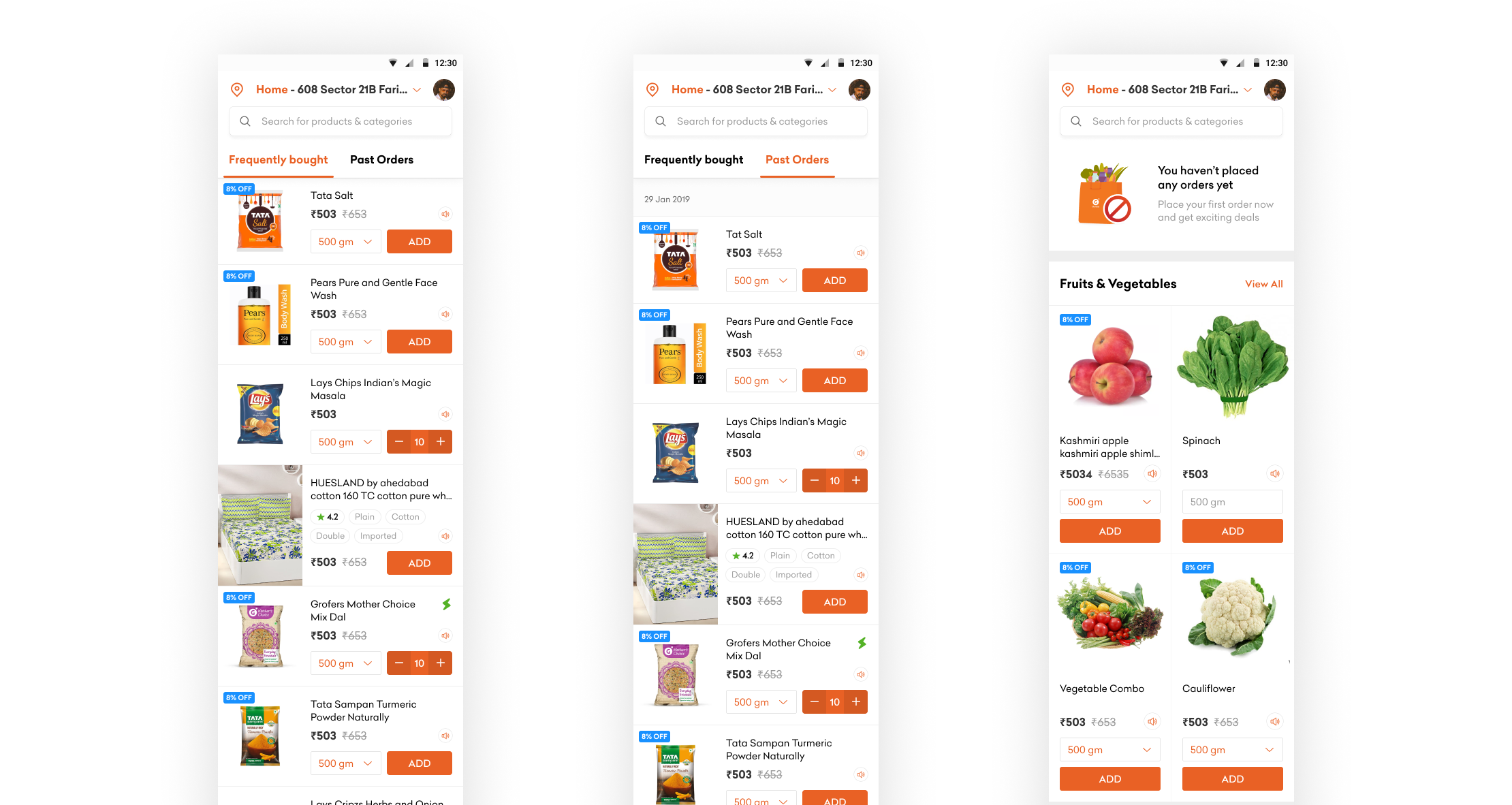
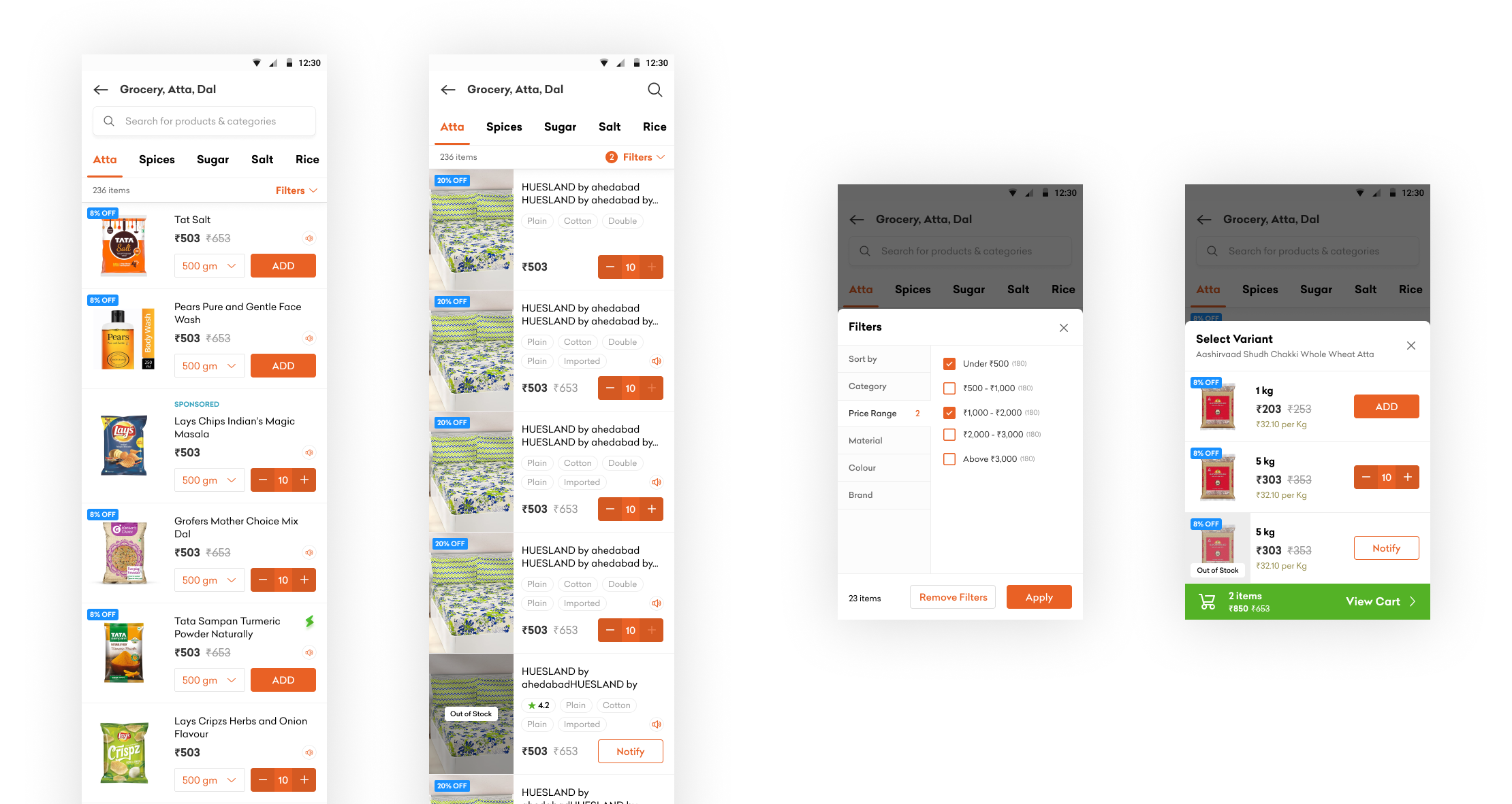
Adding Reorder option
From user insights and interviews, we found out a lot of people wanted the reorder option. Although we had widgets showing those past order items but its discoverability was poor, so we gave it more prominence and reduced the friction by converting reorder widget to a page. We also integrated the option of ordering by 'frequency' or ' past orders'. This reduces the add-to-cart time as more items are visible at a time.
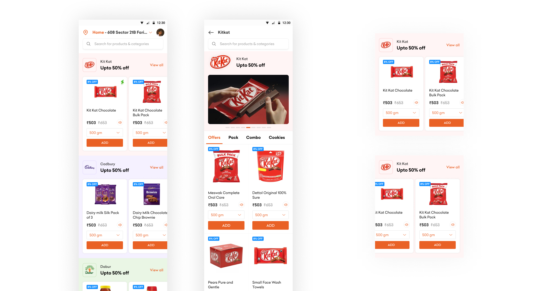
Brand Page
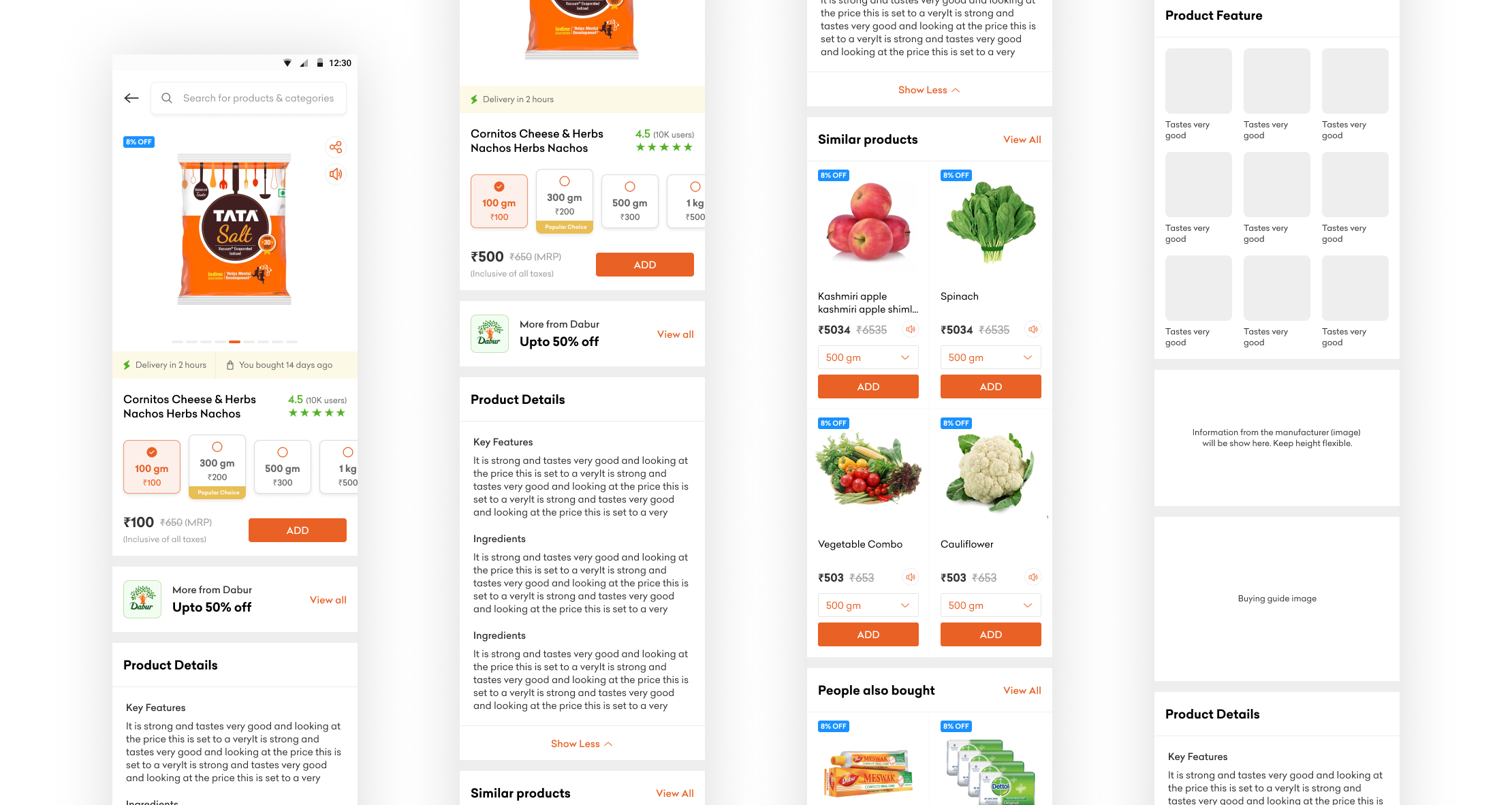
Grocery is a use case where trust matters a lot and people are bound to buy brand specific products. This hypothesis was backed by user interviews where we found out almost everyone has specific categories where they prefer buying branded products. Also, Grofers had already been monetising brand assets and this space would be an addition to it. We placed the Brand Page option in bottom navigation bar to support brand specific journeys. We also showcased products carousels of first few brand for increased add-to-cart penetration.
Product Listing Pages
We have decluttered the product widgets by removing extra non-essential information such as SBC price, and also reduced product cards height. We have increased product image size and removed extra padding space between cards to accommodate more products cards in each fold. The search bar on scroll becomes an icons so as to reduce the persistent space. Also, now the filters and variants all show up in bottom sheet to maintain a consistent experience overall.
Product Description Page
Now the variants are presented along with prices for easy comparison, also we have introduced a "Popular Choice" tag to help user's decision process. Users from here can also explore products of same brand. Also, the product details are now shown vertically in a clubbed manner. For products that have feature details those will be listed in image format for effortless scan of information.
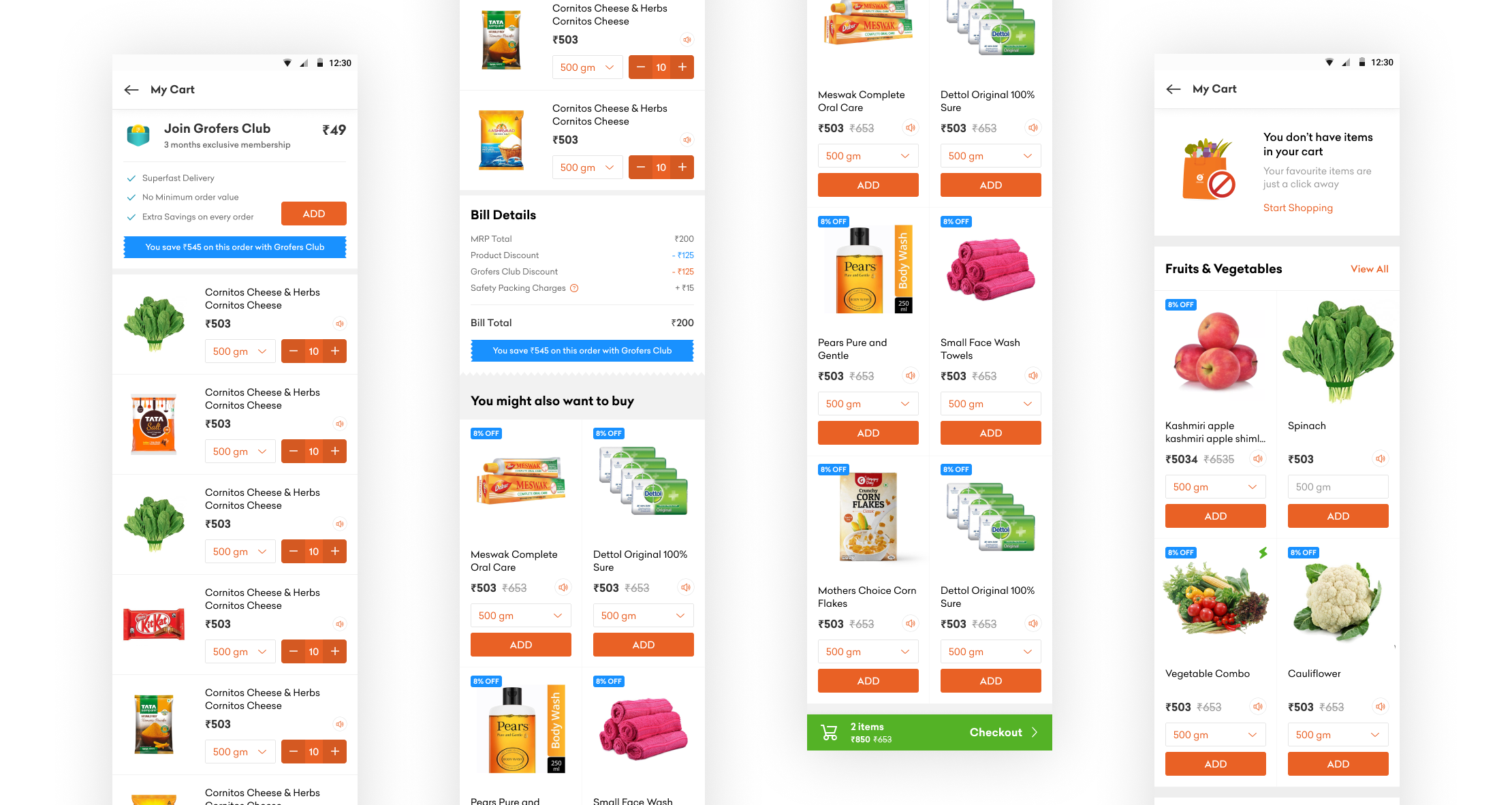
Cart Page
Cart page has been hugely decluttered, we have given prominence to Smart Bachchat Club membership here which also highlights the total savings user can have by buying the membership. Also, bill details have been pushed below the item listing as we already have a persistent checkout strip which highlights relevant information.